


In some sense, the President is fortunate. I predicted a long time ago that he would win re-election if the unemployment rate was under 8 percent.
Well, the new numbers just came out and the joblessness rate is 7.9 percent.
So even though his stimulus failed, and even though his class-warfare tax policy is like a dark cloud over the economy, and even though his plans to further increase the burden of government spending will accelerate America’s descent a Greek-style fiscal quagmire, he may dodge the proverbial bullet.
You can see my latest election prediction by clicking here, and you can even cast a vote in my reader poll, but let’s set aside the crystal ball nonsense and focus on public policy.
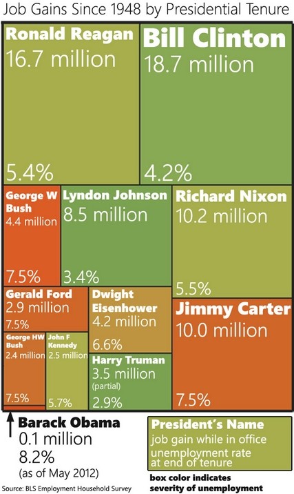
Here are four images that summarize Obama’s dismal performance.
We’ll start with a chart showing what President Obama claimed would happen to unemployment if we enacted his so-called stimulus compared to the actual real-world results.

As you can see, the joblessness rate currently is more than 2-1/2 percentage points higher than Obama claimed it would be if we implemented his Keynesian plan.
Now let’s look at some updated images of how this “recovery” compares to previous recoveries in the past six decades, based on data from the Minneapolis Federal Reserve Bank. We’ll start with the unemployment rate. Take a wild guess which President has presided over the red line at the bottom.

Previously, I’ve compared Obamanomics and Reaganomics, but this image may be even better because it shows all business cycles and confirms that the Obama years have been the worst in post-World War II history.

And we see something similar if we look at GDP growth. Once again, go out on a limb and guess who is responsible for the weakest recovery since World War II.

Last but not least, this info-graphic is a bit dated, but Obama’s dismal track record would not change if we added the past few months of data.
Defenders of the White House argue that all these bad numbers are a legacy of the dismal situation that Obama inherited. That’s partially true. Obama should not be blamed for the depth of a recession that began before he took office.
But he should be held at least somewhat accountable for an anemic recovery. Particularly since he promised “hope” and “change” and then continued the big-spending, pro-cronyism policies of the Bush years.
The moral of the story, needless to say, is that free markets and small government are the keys to growth and prosperity.


Join the conversation as a VIP Member