


According to the most recent numbers from the Bureau of Labor Statistics, the unemployment rate has dropped to 6.7 percent. Is this good news?
Well, it’s depends on your benchmark. Compared to France’s anemic economy and double-digit levels of unemployment, America is in decent shape.
 But if you use data from the Minneapolis Federal Reserve to compare the current business cycle to previous downturns and upturns in the U.S. economy, then the outlook is very grim. Simply stated, the American economy is enduring the worst performance for labor markets since the Great Depression.
Moreover, the Washington Post put together a chart in 2012 showing that Obama was far behind other presidents on job creation (a point humorously reinforced by Michael Ramirez).
Let’s look at some additional data to assess the President’s track record on jobs.
We’ll start with a chart, versions of which I’ve been sharing for nearly four years. It shows the unemployment rate that the White House claimed we would have back in 2009 if the so-called stimulus was enacted, compared to what actually happened.

As you can see, this is hardly a ringing endorsement for the Keynesian notion that more government spending is good for job creation (or for Nancy Pelosi’s laughable claim that you create jobs by paying people not to work).
But even though I’ve used variations of that chart several times, I don’t think it’s the best measure of either employment markets or the President’s performance. The White House can argue, with some validity, that the chart merely shows that the recession was more severe than they first forecast.
And critics of the Obama Administration can argue, also with validity, that the unemployment rate is an inadequate measure because it doesn’t capture the extent to which people drop out of the job market.
Recommended

That’s why I’ve always liked the Labor Department’s figures showing the employment-population ratio. It’s a very straightforward number, showing the share of the working-age population that is employed.
And this data series is perhaps even more unfavorable if we’re giving Obama a grade for jobs.

The big drop took place before the President took office, so that’s definitely not his fault. But he can be blamed for the fact that the labor market didn’t bounce back, which usually happens after a recession.
Having millions of people leave the labor force translates into less economic output.
…economic output is a function of labor and capital. And if you want an economy to produce more, your only choices are to somehow achieve one or more of the following:
- More capital.
- More labor.
- More efficient use of capital.
- More productive use of labor.
In other words, labor and capital are the two ingredients that determine economic performance.
Needless to say, if you have less of one of the ingredients, you’re not going to produce as much.
Let’s look at another chart that reveals the Administration’s poor performance on jobs. James Pethokoukis of the American Enterprise Institute combines concepts by replicating the White House’s chart (including their prediction of joblessness in the absence of a so-called stimulus), but also including red dots showing what the unemployment rate would be today based on the various labor force participation rates that we might expect in a healthier economy.
The startling takeaway from this chart is that the unemployment rate today would be more than 10 percent if people hadn’t dropped out of the labor market!

Very sobering data, indeed.
And the main response from the White House is to argue for more unemployment benefits. That’s not very compassionate, as Senator Rand Paul and I explained in a piece for USA Today.
 By the way, there is no reason to think that labor force was supposed to shrink. Here’s what the Bureau of Labor Statistics predicted in 2007 compared to what’s actually happened.
So we have to ask ourselves why did so many workers leave the labor market? Was it the overall increase in the burden of government? The increase in the minimum wage? The disability scam? Subsidized unemployment? The welfare trap?
The honest answer is either “I don’t know” or “all of the above.” Or maybe something in between.
But I do know that it’s a very bad sign.
 And it’s especially discouraging that we’re seeing a significant drop if labor force participation among males of prime working age.
That may reflect an erosion of social capital, and once a society loses the spirit of self reliance and the work ethic, it’s very difficult to restore those valuable norms. And once a nation has too many people riding in the wagon and not enough people pulling the wagon, that doesn’t bode well.
Since this post has been filled withe depressing data, let’s close by sharing some amusing cartoons.
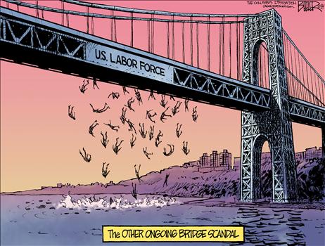
Nate Beeler has produced some gems, so let’s start with this cartoon showing that some people have been stuck in a deep freeze.

And here’s Beeler’s take on the “drop” in labor force participation.
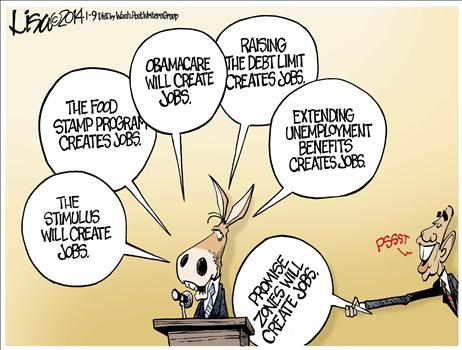
Lisa Benson, meanwhile, mocks the President’s empty talking points.
And Glenn McCoy shows the President’s version of compassion.

These cartoons remind me of the ones I shared last August.
P.S. Careful readers will have noticed that this piece cites both the employment-population ratio and the labor force participation rate. These two data series are sometimes used interchangeably, though I prefer the former for reasons explained in this article for the BLS’s Monthly Labor Review.
P.P.S. On a totally separate topic, I want to share some good news about the International Monetary Fund. The IMF is a statist international bureaucracy that pushed for bad policy, both in America and other nations. Last year, I reported that the Obama Administration proposed to give the IMF more money and authority, but that lawmakers on Capitol Hill wisely rejected the request. Well, the same positive outcome happened again as part of the spending bill just approved by Congress.
Here’s some of what the New York Times reported.
Administration officials concede that Congress’s decision not to make the changes will be an embarrassment to President Obama internationally…congressional Republicans would not budge… The structural changes to the fund have languished since Mr. Obama agreed to the “rebalancing” with great fanfare at the G-20 meeting in Seoul, South Korea, in 2010. …Since the 2010 accord, every nation involved but the United States has ratified it. But the United States remains the monetary fund’s largest contributor, and without Congress’s approval, the restructuring cannot happen.
P.P.P.S. And since I’m sharing random news, here’s something else that may interest readers. Time has a non-political personality quiz that supposedly reveals whether you are liberal or conservative. For what it’s worth, I’m 83 percent conservative and 17 percent liberal. I’m not sure what to think of the test, but it’s definitely better than the “social attitude test” I took last year, which concluded that I’m a “moderate” and “a centrist with few strong opinions.” I much prefer Professor Bryan Caplan’s libertarian purity quiz, where I scored a 94 out of 160, which may not sound impressive, but it was enough to put me in “the heady realm of hard-core libertarianism.”


Join the conversation as a VIP Member