There are two serious problems with America’s Social Security system. Almost everyone knows about the first problem, which is that the system is bankrupt, with huge unfunded liabilities of about $30 trillion.
The other crisis is that the system gives workers a lousy level of retirement income compared to the amount of taxes they pay during their working years. Younger workers are particularly disadvantaged, as are African-Americans because of lower life expectancy.
These are critical issues, but perhaps looking at a couple of charts is the best way to illustrate why the Social Security system is inadequate.
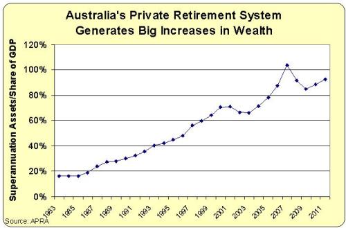
Let’s start by looking at some numbers from Australia, where workers set aside 9 percent of their income in personal retirement accounts.
This system, which was made universal by the Labor Party beginning in the 1980s, has turned every Australian worker into a capitalist and generated private wealth of nearly 100 percent of GDP. Here’s a chart, based on data from the Australian Prudential Regulation Authority.
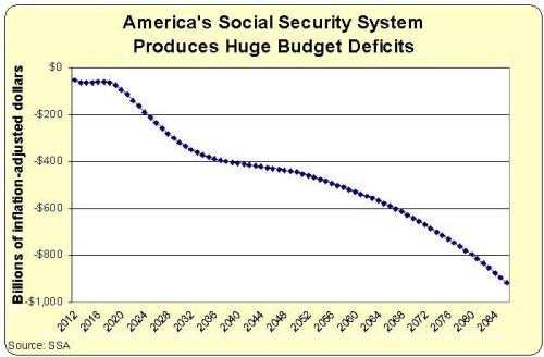
Now let’s look at one of the key numbers generated by America’s tax-and-transfer entitlement system. Here’s a chart showing the projected annual cash-flow deficits for the Social Security system, based on the just-released Trustees’ Report.
Recommended
By the way, the chart shows inflation-adjusted 2012 dollars. The numbers would look far worse if I used the nominal numbers.
The two charts aren’t analogous, of course, but that’s because there’s nothing to compare. The Social Security system has no savings. Indeed, it discourages people from setting aside income.
And Australia’s superannuation system doesn’t have anything akin to America’s unfunded liabilities. The closest thing to an analogy would be the safety net provision guaranteeing a basic pension to people with limited savings (presumably because of a spotty employment record).
So now ask yourself whether Australia should copy America or America should copy Australia? Seems like a no-brainer.


Join the conversation as a VIP Member