


Back in May, Nancy Pelosi's office circulated a chart that purported to "prove" that Barack Obama has presided over the smallest increase in the national debt of any president in the last 30 years. Really:

Looks pretty sharp, doesn't it? Presidential portraits, red and blue partisan bar graphs, science-ish x and y axes, and the all-important "Source: Treasury Department" subscript note. How very official. The Left lapped it up. There's just one problem: It's complete nonsense. Ed Morrissey ridiculed it last week, pointing out that both Politifact (not known for its conservative boosterism) and the Washington Post totally eviscerated Pelosi's numbers. Here's a sample from Politifact's critical assessment of the graph, which the fact-check organization assigned a "pants on fire" rating:
Whoever put the chart together used the date for Jan. 20, 2010 -- which is exactly one year to the day after Obama was sworn in -- rather than his actual inauguration date. We know this because Treasury says the debt for Jan. 20, 2010, was $12.327 trillion, which is the exact number cited on the supporting document that Pelosi’s office gave us. However this error happened, it effectively took one year of rapidly escalating debt out of Obama’s column and put it into Bush’s, significantly skewing the numbers. Using the corrected figures does mean that, superficially at least, Democrats have a point. The debt did still increase more, on a percentage basis, under Bush than it did under Obama. But other problems with the chart and its methodology undercut even this conclusion.
Recommended

After exposing several additional math errors and gross distortions -- like, for example, lack of recognition that Obama has served part of one term, whereas Bush served two full ones -- Politifact keys in on the truth:
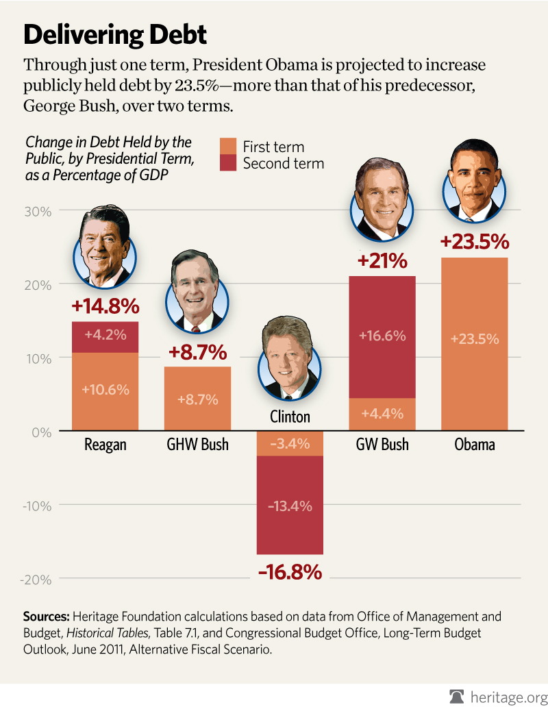
Debt vs. debt as a percentage of GDP: Some economists will tell you that it’s not the size of the debt per se, but rather the size of the debt relative to the nation’s gross domestic product. This helps minimize the complicating effect of economic cycles and inflation. So how do those numbers stack up? Using OMB statistics, here’s what we came up with, using public debt figures not adjusted for the president’s time in office:
Reagan: Up 14.9 percentage points
George H.W. Bush: Up 7.1 percentage points
Clinton: Down 13.4 percentage points
George W. Bush: Up 5.6 percentage points
Obama: Up 21.9 percentage points* (through December 2010 only) *My note: This lofty figure excludes nearly a full year of Obama-era spending.
So by this measurement -- potentially a more important one -- Obama is the undisputed debt king of the last five presidents, rather than the guy who added a piddling amount to the debt, as Pelosi’s chart suggested.
Bravo to Politifact for setting the record straight, but I wonder how many Americans would have believed this rubbish to begin with. President Obama's average annual deficit has been north of $1 Trillion. President Bush's average annual deficit was roughly $250 Billion. If you eliminate the "emergency years" of 2008 and 2009 from the mix, Bush's stats improve, but Obama's remain virtually unchanged. Obama's 2012 budget proposal adds nearly $10 Trillion to the national debt, despite its dizzying litany of tax increases. In August, the gross national debt incurred under this president crossed the $4 Trillion threshold -- the exact number Obama called "unpatriotic" when he was campaigning for president. And it took his predecessor eight years to accumulate that mountain of debt; not less than three. For all of these reasons, Americans intuitively understand that Obama's debt tab is historically destructive. The Heritage Foundation analyzed the real numbers, in the proper context, and derived a chart of their own. The truth hurts, Mr. President:


Join the conversation as a VIP Member