


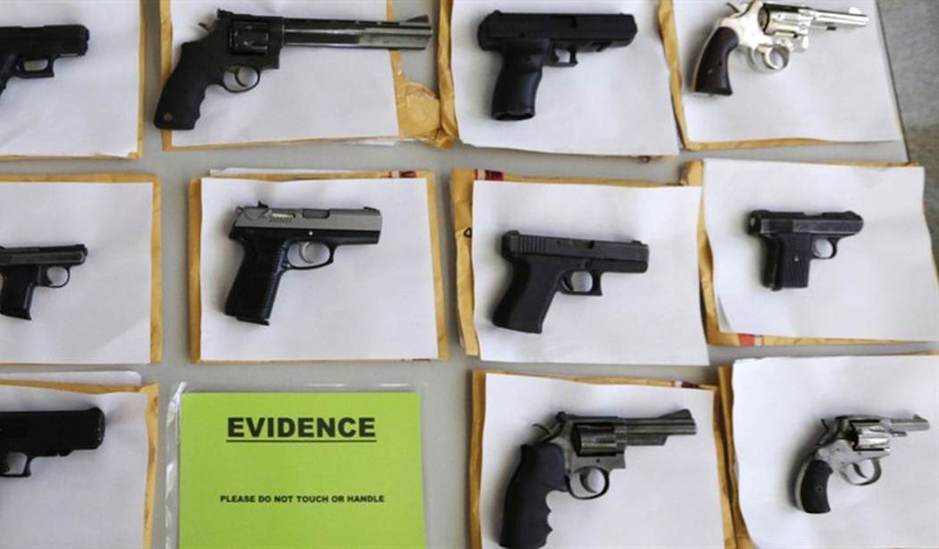
This "map" of "statistics" has been going around Facebook for a while, and recently made a bit of a resurgence. The map purports to show a correlation between areas of high crime and votes for Obama in 2012. There's one problem—it's a hoax.

From a quick glance at the map, several problems immediately jump out:
1. Vermont had seven (7) murders for all of 2012, leading to a murder rate of 0.01 per 1,000 people, yet is dark blue on the supposed "gun violence" map.
2. Michigan, a state that is mostly red on the "gun violence" map, had a murder rate of seven per 1,000 people in 2012.
3. FBI crime maps don't break down county by county on a two-color scale.
4. "High incidents of gun violence" and "low incidents of gun violence" are not appropriate scales for conveying this type of data.
5. The "gun violence map" is in fact a copy of the 2004 election map.
Facts are already on the side of the gun debate. There's no reason to discredit the pro-Second Amendment cause with fake imagery for a quick Facebook or Twitter "like."


Join the conversation as a VIP Member